Screenshot
1. Start with a crisp setup flow
The starter wizard keeps the first interaction simple. Choose a direction, pick the tone, and start with structure already in place.
Turn links, launches, proof, and momentum into a public profile that reads like a living README.
$ readmebio publish --slug your-name
→ live at /u/your-name
Connections
Connect GitHub, X, and Product Hunt to fill your profile with live data — no copy-pasting.
Pull launches, repos, streaks, and traction into a profile that stays current instead of turning into a stale bio.
Shape layout, cards, voice, and proof in a focused canvas that feels sharp, not overloaded.
Go live at /u/your-name with something that reads like shipped work, not a dressed-up link list.
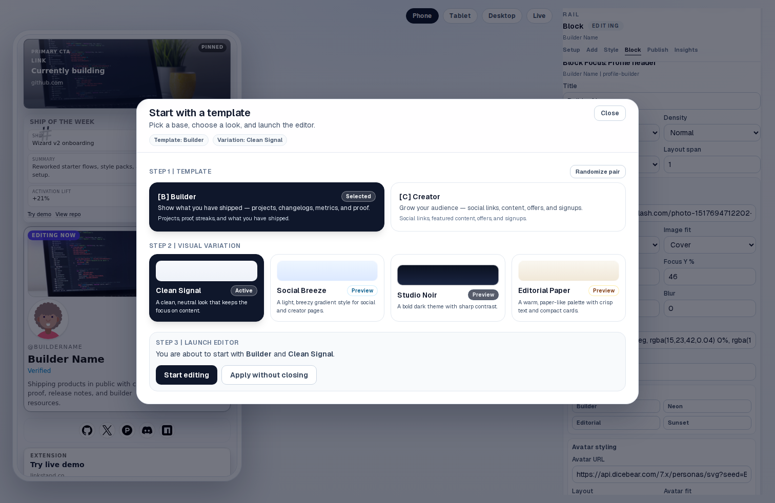
Product tour
Show the path from setup to editing to publishing, while keeping the clean ReadmeBio style intact.
Screenshot
The starter wizard keeps the first interaction simple. Choose a direction, pick the tone, and start with structure already in place.
Screenshot
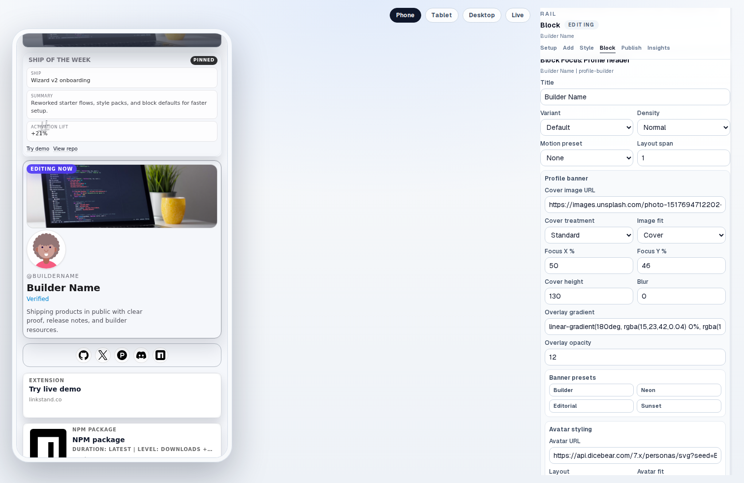
The editor is where the product earns trust. Layout, content blocks, styling, publishing, and insights all live in one surface.
Screenshot
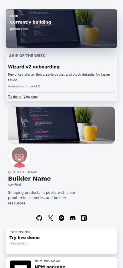
The end result looks authored, not templated. It feels more like a public work log than a traditional link in bio page.
Pro
Pro adds the pieces that only matter once you’re getting traffic — a domain that’s yours, numbers that stick around, and a place for people to reach you.
alex.dev
→ readmebio.com/u/alex
mira.codes
→ readmebio.com/u/mira
Pro
Point yourname.com at your ReadmeBio. We handle the TLS and the routing; you keep the address.
Last 7 days
Pro
90 days of views, clicks, referrers, and top blocks — persistent and exportable as CSV.
Jordan
jordan@parallax.dev
Loved the ship streak block — how do you wire up the GitHub side?
Priya
priya@bit.studio
Would you be open to a sponsorship for our newsletter?
Pro
Form blocks stream into a Pro-only inbox. Export the whole thing as CSV whenever you want.
Why this version lands better
The page is structured around current work, proof, recaps, and useful next clicks, so it feels authored instead of stitched together.
The homepage now shows the real builder flow, the editing canvas, and the published profile in the same visual language as the product.
The visual system stays clean, bright, and editorial. More depth, still no noisy startup theater.
Ready to publish
Start in the canvas, connect your proof, and publish something that reads like a living README instead of a generic link page.